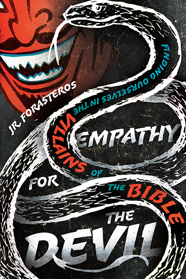
I’m excited to present the cover for Empathy for the Devil, my first book. It comes out in November from InterVarsity Press (you can pre-order it very soon!).
With no further ado, here is the cover:

I have to be honest. I am in love with this cover. Like head-over-heels, asking it go steady till prom in love. When IVP first sent it to me, I shrieked. Loudly. It fits the tone of the book. It feels like me. And it certainly doesn’t look like most of the other books on the Christian Living shelves at the bookstore.
I loved it so much, I asked the cover designer, David Fassett, if I could interview him on his process, and he graciously agreed. David works for IVP, so he does this all the time. Enjoy his take on how this cover came to be:
JR.: How did you get into Graphic Design?
DF: I drew a lot growing up (even though I’m really not great at it) and always loved playing around with computers and technology. I collected basketball cards and was attracted to the different textures and treatments that were used. I was fascinated by album covers and the way they attempted to give visual expression to the music that they packaged. I think what captivated me about graphic design (and still does) was the way that even subtle variations in type, shapes, line and color can significantly change the mood of piece and what is communicated. Design has the power to give expression intangibles that are difficult or impractical (for commercial purposes) to express in words. So I went to school, got a degree in graphic design, worked in a couple small agencies, and came to InterVarsity Press in 2009. I love the challenge of communicating complex ideas in visually compelling ways. When it comes together, it can be magical!
JR.: Did you choose to work on Empathy, or was it assigned to you?
DF: Since I’ve recently become the Art Director at IVP, I’m now responsible to manage the book cover design process. So I do get to decide which books I get to work on and which are given to others. I was very excited to design this cover because it’s a book on a unique topic with a great title. What more can book cover designer ask for?
JR.: What idea was your starting point for the cover? What was your process? What materials did you use as a starting point? Where did you draw an inspiration from?
DF: I read a few chapters of the early manuscript and went through the author questionnaire that you provided and knew that I wanted it to allude to a comic book aesthetic since the word “villain” conjures up comic book characters in the minds of many. You also mention the contemporary fascination with villains in the opening of your book. This direction was solidified when Al Hsu, the editor of the book, sent me over a video that you did where you mention your love for Batman (you were also wearing a Batman shirt).
All that helped me zero in more on the personality that I wanted the cover to have. The title is provocative so I also wanted the cover to reflect that. I saw your comment about the devil looking cartoonish and cheesy and I started thinking about old tracts portraying the devil since they have almost a comic book vibe and seemed instrumental in forming contemporary portrayals/caricatures of the devil. I was thinking of using a snake in some capacity on the cover since they can be a powerful symbol of evil but they can also convey a sense of mystery and ambiguity.
Your book is helping us to see some biblical stories from a different perspective, to see why it seemed plausible for the villains discussed to do what they did and how we can slide into similar patterns of thinking and living so the ambiguity seemed very appropriate. Also when I saw your tattoos, I thought a similar aesthetic would work well for the snake. So I wanted something that brought the aesthetics of comic book villains, tattoos and old gospel tracts together!
JR.: The tone of the cover is fun and unique. How early in the process did you settle on this tone?
DF: It was fairly early in the process that I knew this was one direction that I wanted to try. I also tried some more “literary” treatments as well inspired by older C. S. Lewis covers since this is such a beautifully written book, but I didn’t think they were as effective so I’m glad we went this cover!
(Note from JR.: the design David mentions was the other option IVP sent me and it was amazing as well. He’s incredibly talented.)
JR.: What was most important for you that the cover communicate?
DF: I wanted it to communicate shadowy intrigue (but in a fun, gritty, comic book sort of way).
JR.: Which villain are you most excited for people to read?
DF: I thought the way you unpacked how the story of Cain raises the question of where we find our ultimate identity incredibly insightful.
A huge thank you to David and the whole team at InterVarsity Press. This process has been amazing from the first day.
Please check out more of David’s work right here.
My newsletter subscribers get every book update first. To subscribe, click here! In addition to the book news, you get a round-up of pop culture recommendations (movies, tv shows, books, podcasts, graphic novels) plus a brief scripture reflection.

